Website Design and Information Architecture
On the outset, this website had been housed in a completely disorganized CMS. The organization's website was difficult to manage and was taking up administrative time.
It began like any other project, perhaps, where the website agency identifies an organization, a sector, or a geographical area where they would like to contribute their services. This can be for different reasons; in our case, it was all 3. Petroglyph has always felt closely aligned with the arts, and in Albuquerque we can see its challenges. From our first sit-down together, where we came in already knowing that we could help, it became clear that not only did 516 ARTS fight (or at least spend way too much time and effort) to keep their website up to date, they had limited ability to improve their workflows, and an incredibly complicated website to improve, even with undivided attention, and a growing database of content that lacked organization despite its need for attention.
We knew that we could fix all of this. We could preserve existing content and organize it into types and timelines, where it could be easy to reach, publish and edit. We could keep page-critical HTML out of entries and allow easy drag-and-drop adding and reordering of different types of page elements, giving the client superior command of the presentation of content; one where the story came first, and the consideration of what the website could handle all but eradicated. We could simplify the administrative experience and display everything on a modern front-end that could reflect the Museum's credo: Contemporary Art for Everyone. We could empower them to be online whom they already were in brick and mortar: Albuquerque's Contemporary Art Museum.
When you're loaded up with the tools that can completely reverse these problems and renew the client's relationship with their website, you step in and help, so we did.
The Process
First, we performed on-site research with attendants at the opening of the Puerto Rico: Defying Darkness exhibit. We performed a card sorting exercise where we learned about the difference in the current website's language conventions compared with how the people who use it read them, or how they would differently refer to the same things.
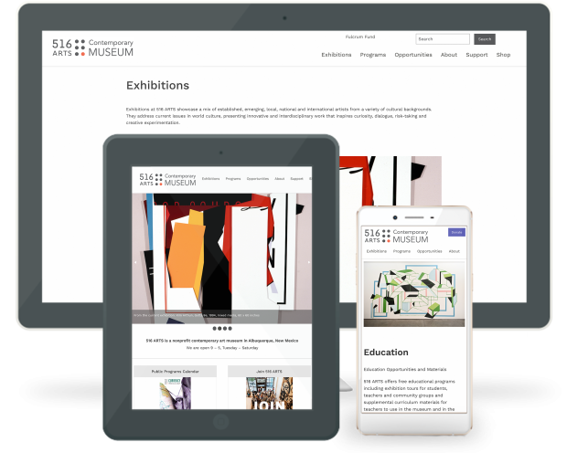
Having learned about the museum's visitors and stakeholders, we reorganized the menu and overall url structure for the website, pulling Exhibitions out of Programs and Program Partners out of Support, keeping the organization simple and reflective of the Museum's goals and day-to-day priorities.
Next, we built a comprehensive wireframe with the Foundation Sites framework, drawing a custom color palette from the Museum's pre-existing red color. We chose fonts and font sizes. We presented grids, paragraph spacing, image elements, a home page slideshow greeting, and a fluid page layout, all designed around the Museum's priority of telling the stories of their exhibits and the ways that they are shared with the public.
After approval of the wireframe, we migrated existing content into ExpressionEngine from the old site into a designated channel we called Old Content. From there, 516 ARTS staff helped sort through each entry into what was a Page, an Exhibition, an Event, a Mural, etc, and after this sorting, we began to customize the website to enhance the properties of each of these content types - like dates on Exhibitions and Events. We added ExpressionEngine's fluid field feature almost universally to each content type, allowing for drop-in text, related content, slideshows, embed codes, portrait blocks, downloads - anything they would need or were already using that could be intelligently added and re-ordered for maximum impact and content-forward experience.
The templating process was long, but exciting. Watching the website take shape one page type at a time slowly revealed that our approach was going to be not only valid, but powerful. We were elevating the web presence of the Museum from one of day-to-day reference to one of historical archive, where exhibitions lived at permanent URL's, could be organized by any metric, could be searched by content, or found by artist. For now, they would live in chronological order headlined by year on the exhibitions page. The full experience of this contemporary art museum would now be in full display in photography, content, online catalog reference, and related content, wherever the administrators, not the website, decide they should be, easily browsed, and intuitively found.