We are so excited to introduce you to.. us. We are now Aquarian Web Studio, LLC - and for so many reasons it feels like we are finally being called by our true name. Hopefully, I can explain -
Petroglyph Creative - inspired by New Mexico
When I went out on my own in 2010, I did so out of a home very close to the Petroglyph National Monument - a place where drawings made by native peoples hundreds of years ago still exist in protected space. The name appealed to me as a way to honor the history of the land I lived on as did the ethereal nature of the evocations of Petroglyphs - the duality they carried in their ancient rigidity and the fluid ambiguity carried in their forms and placements. What are they - why here? The florid possibilities swirl around the imagination in the New Mexico wind.
While the name wasn't problematic, it wasn't exactly focused either. It wasn't the kind of brand that came out and told you who we were, or gave any kind of indication what it was like to work with us. It wasn't even pronounceable for some folks outside the state of New Mexico. The spelling usually needed to be paced over the phone, pronunciations reassured. It was memorable for its complexity and abstractness which while better than nothing, is not ideal.
Aquarian grew from Petroglyph
In 2018, Petroglyph grew from 1 to 2, then 3 then 4 at the end of 2020. As new faces took their places in the team, it became clear that Petroglyph suddenly had space to declare values, turn up a culture, and provide a space for personal & professional development in terms of problem solving, strategy, collaboration, and skills. In a core team of 4 women, we found that we all had quite a bit of overlap in interests, tenacity in solving problems, communication styles, and perhaps alarmingly - the need for safe space to be ourselves and do our work. It turns out just being cool and providing this in a meaningful way really did make Petroglyph a special place to work and collaborate. We were able to add Content Strategy, Search Engine Optimization, and Social Media management, as well as add additional resources and talent to Web Development and Web Design. There's been growth for everyone involved. But another thing was happening - Petroglyph was becoming something else.
Our clients hire us to bring traffic to their websites, knowledge to their websites, - much the same way the Water Bearer brings water to field crops or anywhere else to provide hydration and nourishment. We provide education and strategy to our clients and improve the authority of their voices over time as well as increase online sales, conversions, and engagement outcomes. The Water Bearer is an ancient archetype, and even if you’re not versed in Western mythology, its depiction as a graceful figure pouring water from two large urns instantly surfaces ideas of abundance, flow, balance and giving.
With more than just Web Development in our competencies and a renewed focus in our personal missions for being present, it became time to organize our skills and direction underneath a larger-than-individual mission. "Lead, Follow, and Get Out Of The Way" was one, but that just describes our approach to web development. Our mission was really to bring success to business owners (and let's face it; ourselves) in knowing what we know about the web. Over months of thinking about this, what surfaced as an identity was not any form of mission statement but rather an archetype: the Water Bearer.
Aquarian, while being distinctively historic and also cutting-edge as "the new age" .
There were other supportive reasons why we went with Aquarian:
- Aquarian tops alphabetical lists, relative to Petroglyph.
- More people can pronounce "Aquarian" than Petroglyph.
- We got the "webdesign.com" URL! That was worth it on its own.
- Founder Caroline is an Aquarius in the vedic astrology system.
- In New Mexico and Arizona, we don't live near any water so we get disproportionally excited about it - boating, swimming, you name it.
Logo, Fonts & Colors
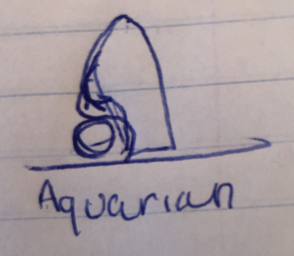
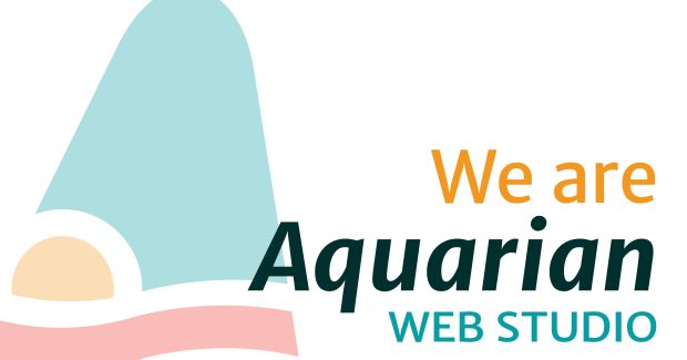
The logo began as a sun-at-your-back seascape featuring a sailboat, embodying the safety of an expertly-guided boat. With Demetria's amazing graphic design expertise, we went through a couple of different directions before finally settling on:
The angles of the one on the right evoked the speed of a traveling sailboat trading the complete safety of the one on the left for the motion and exhilaration of sailing. It also downplayed other unintended associations portended by the first example (Traffic cone? we can work with that. Clown hat? not so much. Thank you for these Niki.)
While the logomark image drew its inspiration from oceans and lakes, the color palette was derived right here, on desert Route 66. A conceptual shift from sailboat to convertible is what it takes to get to here - glowing neon cherry reds, expansive orange sunsets, and bright turquoise - on cars, in the sky, in the stones in the earth. We really didn't have to go through more than one round on this. Despite taking our mark to the ocean far away, we were able to root it close to home.
The choice to change the font from FF Meta Pro to Merriweather was a tough one but it matched our collective energy more closely. We plan to alternate brand colors in the subheading for seasonal fun or variation.
This is the dawning
Of course, we've had a bit of fun with that Age of Aquarius song. Who hasn't? While some people make fun of its bawdy reveling (and so do we,) we appreciate that the song rings in a potential shift in consciousness as the astrological age shifts from one sign to another, and how mere participation in the shared belief that this could happen appears to offer peek-a-boo access to its advertised higher consciousness. In shifting our brand to Aquarian Web Studio, we are claiming some buy-in to the story that we are on the verge of something great. We are your like-minded website partner; guiding you into what this could mean for you online. We truly do believe that we are on the verge of something great - perhaps while already being in something great; and clients are invited to take that journey with us.
We fully expect to be evaluated by our Aquarian name by potential clients who do and don't identify with our outlook. We also expect folks who do identify with it or at least see it as the source of strength and clarity to be an entirely natural fit for our services. Some businesses choose neighbor niches where they work for everyone and their competition. Some choose niches based on service channels. We do it all; and our niche is not easy to define even in today's terms, but it focuses on those organizations that are mission driven from deep within. We understand why you are doing what you are doing and we are a website strategy company that is available to help; to advise your online presence, fill in the gaps, execute your strategy and take you to your goals. Even if you can't fully bring the total vision of your inner drive to the table, it's ok; we can and will help you develop it. We have the technical chops, the work history, the skill you would expect from any full-service web agency; but we will come in with our creative intuition, lived experience, and history of wins and work with what you have.
So, join us in celebrating the dawning of the Age of Aquarian. As we transition from the last 11 years to our next exciting phase, we thank you for your patience as we catch up with social media, this website, and whatever else is out there. We thank you for helping us spread the word!